Vitra House | T7

During my visit to Switzerland I had the privilege of visiting VitraHaus in Weil Am Rein, Germany. The Architects behind the VitraHaus were Herzog & de Meuron (2009). The store features many showrooms that show its user's many different ways inwhich they can layout their own homes, with the gift shop/ VitraHaus Store and Cafe on the bottom level.
FIGURE ONE: VitraHaus (2009)
 FIGURE TWO: Me Outside VitraHaus


FIRST FLOOR | 'Alice In Wonderland' Theme
 FIGURE THREE: Lighting Fixtures
 FIGURE FOUR: 'What Will Become Of Me?'
FIGURE FIVE: Oversized Teapot

The first floor of the VitraHaus was 'Alice In Wonderland' themed, which heavily featured a blush pink meets baby pink. The products in the space varied between being oversized or miniature, also the lighting fixtures resembled clouds made of a paper-like material, which also was a mixture of task, decorative and ambient lighting.


SECOND FLOOR | Lighting
FIGURE SIX: Lighting
 FIGURE SEVEN: Lighting
 FIGURE EIGHT: Lighting
 FIGURE NINE: Lighting
 FIGURE TEN: Lighting
 FIGURE ELEVEN: Lighting
FIGURE TWELVE: Lighting

The second floor of the VitraHaus had a mixture of beautiful task lighting all held within a black frame. The lighting fixtures had clear similarities and differences. They were all made from a thin paper-like material, but they all had erratic, yet beautiful shapes.

THIRD FLOOR | Office Spaces
FIGURE THIRTEEN: Plants 
FIGURE FOURTEEN: Decorative Task Lighting
FIGURE FIFTEEN: Shelving Units
FIGURE SIXTEEN: Bauhaus Lighting
FIGURE SEVENTEEN: Plants In The Office Space

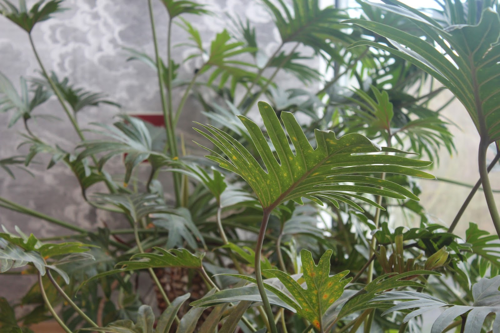
The third floor of the VitraHaus was my favourite floor by far, as there was a superfluous number of plants throughout the space which would provide any user with clearer air and all round, just a nice environment to work in. Also seeing as green is a natural colour, it's also bound to make users feel at ease, therefore also reducing anxiety levels too!!

Overall, I was truly inspired by the VitraHaus, mainly due to both the Architecture and the Interior Design. The interlocking houses that make up the structure of the VitraHaus are beautiful to look at either up close and far away. I also love how the interior somewhat links to the exterior. It's obvious on the inside that the houses do not perfectly sit on top of each other, but the majority of the interior features light colours compared to the exterior.


SOURCE:
FIGURE ONE: Author's Own
FIGURE TWO: Author's Own
FIGURE THREE: Author's Own
FIGURE FOUR: Author's Own
FIGURE FIVE: Author's Own
FIGURE SIX: Author's Own
FIGURE SEVEN: Author's Own
FIGURE EIGHT: Author's Own
FIGURE NINE: Author's Own
FIGURE TEN: Author's Own
FIGURE ELEVEN: Author's Own
FIGURE TWELVE: Author's Own
FIGURE THIRTEEN: Author's Own
FIGURE FOURTEEN: Author's Own
FIGURE FIFTEEN: Author's Own
FIGURE SIXTEEN: Author's Own
FIGURE SEVENTEEN: Author's Own

Mental Disabilities | T5

In recent years it has been proven that students seeking medical help and counselling has increased (BBC, 2015). In Reading University alone, the number of students requesting counselling is said to be increasing by 20% year-on-year. With the overall UK average of students requesting counselling/medical help increasing by 10% (BBC, 2015).  Another piece of data showed that Architecture ranks 5th in the list of jobs most linked to suicide (Dezeen, 2016). I thought that this applied mainly because Architecture and Interior Design frequently overlap, and my clients for Millennium Point are Interior Design students. These figures clearly indicate that universities have large negative effects on their students mental and wellbeing. Students are leaving university with more than they bargained for. They're leaving either with a MA or a BA in their desired subject, along long term mental illness.

Due to the fact that my study pod in Millennium Point would be set in the year 2020; I believe that with increasing intuition and maintenance fees, many students are going to have more and more mental illnesses. So I wanted to manipulate my pod/interior that would surely reduce their mental illness symptoms, or at least make them feel at ease once entering the space.


One major way in which the interior can be manipulated subliminally to aid the students is colour. It's been proven that colours like Red or Yellow can be amazing colours that can encourage creativity and creation (Huffington Post, 2011) However if they are used too heavily, they can cause people (especially people with ADD/ADHD to become aggressive or agitated. Whereas colours like Blue and Green are colours that ultimately make even people without ADD/ADHD calmer (Huffington Post 2011).
FIGURE ONE: Reach and Rise                                                                      FIGURE TWO: MAGDA Easy Chair

By comparing the 2 interiors above, it's obvious to see that they are both beautifully crafted and well thought out interiors. However they have 2 clear differences too; with one being mainly Red and the other Blue. With mental illnesses and learning difficulties in mind, many users would find the interior on the right (Red) to be bearable only for a short period of time, and they would in turn find the interior on the left (Blue) to be bearable for long periods of time. Thus proving that colours play a large role when it comes to making users either comfortable or uncomfortable.


FIGURE THREE: The Templeogue Dental Practice

The Architectural firm Urban Agency, designed a dental practice in Dublin ('The Templeogue Dental Practice') The architects designed the dentists in order to make visiting the dentist less of a scary experience. The used a healthy mixture of natural and calming materials that instantly make users feel safe and warm. For example, wood panelling and plants, also the minimal colour palette, of beige, grey and white is enough to make any user feel at ease.
FIGURE FOUR: The Templeogue Dental Practice

Another reason why I chose this space in order to gather inspiration was mainly due to the fact that the use of daylighting, along with decorative/task lighting, would definitely reduce the anxiety levels in the patients. The large windows also play a role in this, as they would help keep the patient distracted and calm also.

Also another aspect to this space that I realised was that all the planes are of a different material/colour, meaning that someone with visual impairments would be able to experience this space with ease, just as much as the next user who has slightly better eyesight.


Overall, I want to create a space where multiple students from different mentally and physically impaired backgrounds can all work together in harmony without feeling like they're a burden on anyone else. A space where students who have either depression or anxiety can work with ease. Even if they have a lot on their mind, the space should provide them with ample setting/atmosphere to make them calm again. The Templeouge Dental Practice proves that Interior Design can play a large role when it comes to either aiding or worsening a user's disabilities.


SOURCES:
FIGURE ONE: Richardson Sadeki (2016) 'Reach and Rise' Available here: http://www.wallpaper.com/design/brickell-city-centre-interiors-by-richardson-sadeki-revealed-in-miami?utm_content=bufferd2a5d&utm_medium=social&utm_source=pinterest.com&utm_campaign=buffer#164687 Last Accessed: 05/03/17
FIGURE TWO MAGDA Chair (2015) 'Easy Chair' Available here: https://www.behance.net/gallery/24262803/MAGDA-Easy-chair Last Accessed: 05/03/17
FIGURE THREE: Designed by Urban Agency (2016) 'Templeogue Dental Practice' Available here: https://www.dezeen.com/2016/09/25/templeogue-dental-practice-urban-agency-curved-walls-wood-paneling-dublin-ireland/ Last Accessed: 04/03/17
FIGURE  FOUR: Designed by Urban Agency (2016) 'Templeogue Dental Practice' Available here: https://www.dezeen.com/2016/09/25/templeogue-dental-practice-urban-agency-curved-walls-wood-paneling-dublin-ireland/ Last Accessed: 04/03/17
CITATION: BBC (2015) 'Rising numbers of stressed students seek help' Available here: http://www.bbc.co.uk/news/education-34354405 Last Accessed: 05/03/17
CITATION: Dezeen (2016) 'Architecture ranks fifth in the list of jobs most linked to suicide' Available here: https://www.dezeen.com/2016/07/06/architecture-ranks-fifth-jobs-most-likely-suicide-centers-disease-control-prevention-usa/ Last Accessed: 05/03/17
CITATION: Huffington Post (2011) 'How Colour Can Make You Feel At Home' Available here: http://www.huffingtonpost.com/2011/09/30/how-colors-can-make-you-feel-at-home_n_988498.html Last Accessed: 05/03/17

Shibuya Apartment 201 & The Chalet de La Plage | T8

FIGURE ONE: Shibuya Apartment 201

Due to the site at Millennium Point being quite rigid and industrial, I wanted to focus on interiors that contrasted. Mainly ones that featured materials that were grown rather than mined. 

The Shibuya Apartment features a heavy contrast between warm and harsh materials/finishes, using a mixture of wooden panels and white paint. However the overall use of the Apartment is to relax visitors as it allows them to experience in a way they wouldn't be able to at home.

"Our goal in this design is to provide such special elements in order to increase the excitement and enjoyment for out guests and to let them experience things they never would in a normal home,"

FIGURE TWO: Shibuya Apartment 201

I love this idea of having an interior intended for a special use, where users wouldn't be able to experience it everyday. Many students are able to study from home in the same working environments daily, but I'd love to create a space where the students feel that it's specifically a luxurious space.


FIGURE THREE: Chalet de La Plage

Another space that I found that shows a heavy contrast is The 'Chalet de La Plage'. The exterior features a harsh black finish which is in contradiction to the quiet and remote landscape around it, whereas the interior has a beautiful light and upbeat atmosphere.
FIGURE FOUR: Chalet de La Plage
FIGURE FIVE: Chalet de La Plage

Overall, I love this idea of contrasting the space, as it's bound to change many user's perception of design, space and material finish. 9/10 times many people assume they know how an interior just by judging the exterior, and they persist on keeping this assumption until they finally enter the space. More often than not, the interior exceeds everyone's expectations. Which is the route that I plan on taking with my study pod in Millennium Point.


SOURCES:
FIGURE ONE: Hiroyuki Ogawa (2016) 'Shibuya Apartment 201' Available here: https://www.dezeen.com/tag/hiroyuki-ogawa-architects/ Last Accessed: 05/03/17
FIGURE TWO: Hiroyuki Ogawa (2016) 'Shibuya Apartment 201' Available here: https://www.dezeen.com/tag/hiroyuki-ogawa-architects/ Last Accessed: 05/03/17
FIGURE THREE: La Shed Architecture (2015) 'Chalet de La Plage' Available here: https://www.dezeen.com/2016/12/17/chalet-de-la-plage-black-beachfront-cabin-white-interior-quebec-canada/ Last Accessed: 05/03/17
FIGURE FOUR: La Shed Architecture (2015) 'Chalet de La Plage' Available here: https://www.dezeen.com/2016/12/17/chalet-de-la-plage-black-beachfront-cabin-white-interior-quebec-canada/ Last Accessed: 05/03/17
FIGURE FIVE: La Shed Architecture (2015) 'Chalet de La Plage' Available here: https://www.dezeen.com/2016/12/17/chalet-de-la-plage-black-beachfront-cabin-white-interior-quebec-canada/ Last Accessed: 05/03/17

Vitra Museum | T6


The Vitra Design Museum is a museum located within Weil Am Rein, Germany. The museum celebrates many different styles and types of design. The main architect was Frank Gehry and the museum is actually the first piece that F.Gehry completed in Europe.


 FIGURE ONE: Vitra Design Museum
FIGURE TWO: Vitra Design Museum 
FIGURE THREE: Vitra Design Museum 
FIGURE FOUR: Vitra Design Museum 
 FIGURE FIVE: Douglas Coupland (2011-20117) Slogans for the 21st Century
FIGURE SIX: Selfies in the Vitra Design Museum 


VIDEO ONE: Rotating Pod
FIGURE SEVEN: Sketch of Rotating Pod

Within the Vitra Museum, there was a robotic pod that was able to rotate either 180degrees vertically or 360degree horizontally all from an application within a smartphone. I really love the idea of being able to control the study pod/area from a smartphone. It's extremely realistic, and with the study pod for Millennium Point being based in 2020, it sounds extremely plausible.

VIDEO TWO: Lift-Bit
FIGURE EIGHT: Sketch of Lift-Bit

Also within the museum, there were robotic seats that could also be controlled via an application on a smartphone. The Lift-Bit, is able to change rapidly into any type of seating the user(s) needed. It can transform into a bed, sofa, couch etc. 


VIDEO THREE: Björk (1997) All Is Full Of Love

The Artist Björk, created a very controversial music video in 1997, that shows 2 robots being assembled and then sharing intimate kisses. The was video created in order to show the link between non emotional technology and emotional humans. I was extremely fond of this video as it was step in the right direction, and somewhat represents the different ways in which people look at the varying aspects technology can have.


CONCLUSION
Having visited the Vitra Museum, I definitely want to consider the different types of functions and activities that are needed within my designed studio space. I want there to be a clear function between the users and the technology included. I would also like the users and people entering and experiencing the space to realise that they needn't be scared of technology, but should instead, embrace it, and appreciate the fact that it has come such a long way in the past 100 years and that it can aid humans in many, many ways that weren't even possible 5 years ago, let alone 100 years ago.


SOURCES:
FIGURE ONE: Author's Own
FIGURE TWO: Author's Own
FIGURE THREE: Author's Own
FIGURE FOUR: Author's Own
FIGURE FIVE: Author's Own
FIGURE SIX: Author's Own
FIGURE SEVEN: Author's Own
FIGURE EIGHT: Author's Own
VIDEO ONE: Author's Own
VIDEO THREE: Björk (1997) All Is Full Of Love. Uploaded:10/08/10 Available Here: https://www.youtube.com/watch?v=AjI2J2SQ528 Last Accessed: 01/03/17

Materials for Design | T4

FIGURE ONE: Lefteri, C (2014) Materials for Design


In the introduction of Chris Lefteri's 'Materials for Design' (2014), he mentions a specific point.

"- the information that you receive on your phone, laptop, TV, or the increasing number of other screen-based electronic devices will change the physical interaction you have with materials rather than change the way they look" 

This point alone, is enough to make designers think about the impact that technology has/is/will have on our connection with our surrounding environment. For example, 'screen-based electronic devices' are the main reason as to why many people ignore the beautiful buildings, landscape and people around them, however with the aid of designers, there could potentially be a material/product/service that can help bring the best combination forward; 'Technology and genuinely curious people'. Meaning that people can enjoy using technology just as much as they previously would, but it would also help them look at certain mundane tasks in a different way


GROWN
In this chapter of the book Lefteri, talks about materials that all natural, 'fish leather, textiles created from bacteria and horsehair, plastic made from chicken feathers, and the more usual grown materials such as plant fibres and wood.'


OIL BASED
In this chapter, Chris ventures to talk about all forms of plastics and how over the years they have slowly changed from Bakelite and are now currently as intriguing as ever and can be made in different ways. E.g Thermosetting and thermoplastics.

MINED
Within this chapter Lefteri, mentions materials like Glass, Metal (alloys and ores) and Ceramics and many, many other materials that are also extracts from the ground/Earth.


MY TABLE
 FIGURE TWO: Flexible Task Lighting Table

Taking into consideration the point mentioned above about screen-based technology changing our physical reactions with materials; I designed a table that can allow the user work with ease at this station. Mainly by providing them with the usual task lighting so that they are able to work with efficient lighting, however in this case, I designed a table where the table can sense exactly which part of the table the user is working from, and then the desk lamp would move to the best spot, providing the user with ample and sufficient lighting.

FIGURE THREE: Flexible Task Lighting Table
FIGURE FOUR: Table In Section (1:20 @A3)

The materials that I wanted to use to create for my table included Cellulose and Pewter. Cellulose, due to the fact that it has a large variety of uses and is widely available. The main disadvantages that of the use of Cellulose is that it can be quite energy-extensive.  However, I believe that positives out-weighed the negatives, the main one being that it is widely available, ergo it wouldn't be expensive to obtain. Pewter, because it's very malleable and its high gloss finish is perfect for giving off a luxurious feel, despite it's low cost (£30 per Kg). Another reason for using Pewter is because with it's high gloss finish, user's with visual impairments would be able to see the difference between the table legs and the ground.


SOURCES: 
QUOTE: Lefteri, C (2014). Materials for Design. London: Laurence King Publishing.
FIGURE ONE: Lefteri, C (2014) Materials for Design. Available here: https://www.bookdepository.com/Materials-for-Design-Chris-Lefteri/9781780673448 Last Accessed: 01/03/17
FIGURE TWO: Author's Own
FIGURE THREE: Author's Own
FIGURE FOUR: Author's Own

Controlled & Uncontrolled Space | T3

FIGURE ONE: Birmingham City University Parkside Atrium

The main entrance\atrium space that users are greeted to upon entry at the Parkside Campus at Birmingham City University, features a rather minimal colour palette, with a mixture of warm and harsh materials.

As I entered the space, I'm instantly reminded of Bentham's theory of the Panopticon (1700s). The theory features a single watchman central to a prison, so that he is able to watch any of the inmates as and when he feels. However there is no actual way of the single watchman being able to see all of the inmates but it forces them to remain concerned with their behaviour.

Looking over from any floor inside the Parkside building, users are able to see all the way down to Level 0 (the Ground Floor). Meaning the people on the bottom floor may feel a little uneasy as they can easily be watched from anyone from any of the 4 floors above.

FIGURE TWO: Parkside Entrance

From the images above and the video below you can see that the minute you enter the space, your presence is logged possibly 3 times over. As there are cameras in the lobby area, and in the video below you can see that the doors opened for me.

VIDEO: Entering the Parkside Building
FIGURE THREE: Author's Own                                                                       FIGURE FOUR: Author's Own
FIGURE FIVE: Parkside Bathroom (4th Floor)

However with close analysis, I realised that the few places where people's presences aren't logged, are private and public bathrooms. The toilets in Parkside have no cameras, meaning it is one of the few 'Uncontrolled' spaces. The video below shows another blind spot/ Uncontrolled Space within the Parkside Building on the 4th floor

VIDEO TWO: Blind Spot (Level 4)


CANNON PARK SHOPPING CENTRE

The place that I chose to analyse myself was the Canon Park Shopping Centre, Coventry.
The shopping centre is a widespread open area that has 3 main entry points, meaning that there are a large number of ways the user's presence is logged upon entry.


VIDEO THREE: Cannon Park Shopping Centre


SOURCES:
FIGURE ONE: Author's Own
FIGURE TWO: Author's Own
FIGURE THREE: Author's Own
FIGURE FOUR: Author's Own
FIGURE FIVE: Author's Own
VIDEO ONE: Author's Own
VIDEO TWO: Author's Own
VIDEO THREE: Author's Own

Altro | T2 0.3

FIGURE ONE: Altro Entrance

At ALTRO I was briefly talked to about sustainable materials that were perfect for different types of working and living environments.
FIGURE TWO: Altro's wall of samples
FIGURE THREE: Altro's wall of difference flooring finishes

The offered a mixture of materials that all had different properties, but they almost always kept health and safety in mind.
They also supplied flooring that featured acoustic properties that were able to drown out the sound in a specific interior space. I'm very fond of this material/flooring as the with the current module in mind, of understanding and knowing about disabilities. By being able to play around with and reduce the acoustics in a space, would benefit many users within in a space.


SOURCES:
- FIGURE ONE: Author's Own
- FIGURE TWO: Author's Own
- FIGURE THREE: Author's Own
- FIGURE FOUR: Author's Own

Orange Box | T2 0.2

17.02.2017 consisted of taking a trip down to Clerkenwell, London, in order to visit the ORANGE BOX showroom. Inside the showroom, I was shown a mixture of innovative working solutions, for example;

Located on the wall in Orange Box interior, we were greeted with a wall with a finish also know as 'Clear Erase' which allows the user to draw/produce content directly onto wall. It removes the need to purchase a whiteboard for the interior and can definitely make the finished design look really sleek.
 
 The green colour of these pods would ultimately make the user relaxed within the space and ready to work.
The walls were padded with sound boarding that reduced the acoustics within the space, making there less of an echo present, therefore making the space more bearable.
The materials for the chairs had carefully been considered, which would provide the users with comfort as well as offer a sleek and contemporary design.


SOURCES:
FIGURE ONE: Author's Own
FIGURE TWO: Author's Own
FIGURE THREE: Author's Own
FIGURE FOUR: Author's Own
FIGURE FIVE: Author's Own
FIGURE SIX: Author's Own
FIGURE SEVEN: Author's Own
FIGURE EIGHT: Author's Own
FIGURE NINE: Author's Own
FIGURE TEN: Author's Own
VIDEO: Author's Own