Altro | T2 0.3

FIGURE ONE: Altro Entrance

At ALTRO I was briefly talked to about sustainable materials that were perfect for different types of working and living environments.
FIGURE TWO: Altro's wall of samples
FIGURE THREE: Altro's wall of difference flooring finishes

The offered a mixture of materials that all had different properties, but they almost always kept health and safety in mind.
They also supplied flooring that featured acoustic properties that were able to drown out the sound in a specific interior space. I'm very fond of this material/flooring as the with the current module in mind, of understanding and knowing about disabilities. By being able to play around with and reduce the acoustics in a space, would benefit many users within in a space.


SOURCES:
- FIGURE ONE: Author's Own
- FIGURE TWO: Author's Own
- FIGURE THREE: Author's Own
- FIGURE FOUR: Author's Own

Orange Box | T2 0.2

17.02.2017 consisted of taking a trip down to Clerkenwell, London, in order to visit the ORANGE BOX showroom. Inside the showroom, I was shown a mixture of innovative working solutions, for example;

Located on the wall in Orange Box interior, we were greeted with a wall with a finish also know as 'Clear Erase' which allows the user to draw/produce content directly onto wall. It removes the need to purchase a whiteboard for the interior and can definitely make the finished design look really sleek.
 
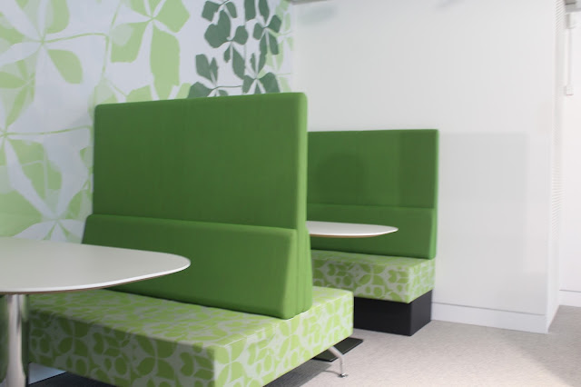
 The green colour of these pods would ultimately make the user relaxed within the space and ready to work.
The walls were padded with sound boarding that reduced the acoustics within the space, making there less of an echo present, therefore making the space more bearable.
The materials for the chairs had carefully been considered, which would provide the users with comfort as well as offer a sleek and contemporary design.


SOURCES:
FIGURE ONE: Author's Own
FIGURE TWO: Author's Own
FIGURE THREE: Author's Own
FIGURE FOUR: Author's Own
FIGURE FIVE: Author's Own
FIGURE SIX: Author's Own
FIGURE SEVEN: Author's Own
FIGURE EIGHT: Author's Own
FIGURE NINE: Author's Own
FIGURE TEN: Author's Own
VIDEO: Author's Own

Brunner | T2 0.1

I'm fascinated by the mixture of finishes that the user is greeted to when entering Brunner. The main focal point, would be the immediately dark stairs that lead you either to upstairs or downstairs, which is all located directly in front of a very rustic wall. I really am fond of the juxtaposition.
Chairs that are stackable and stack vertically instead of diagonally, ergo creating more space within the interior and therefore allowing the students to complete and do more within the interior.
 Brunner has recently created a very innovative idea of having individual study pods that can be perfect for either students or business work desks. Products similar to the image above, could be featured within my student pod, mainly because the design allows the interior space a whole, to be broken up, whilst also allowing each student to work individually.
Overall, Brunner offered a very realistic approach to dividing space, whilst also making it a sociable working area.

SOURCES:
- FIGURE ONE: Author's Own
- FIGURE TWO: Author's Own
- FIGURE THREE: Author's Own
- FIGURE FOUR: Author's Own

Simply Gym | T1

FIGURE OINE: Simply Gym Reception Area

The space that I chose to analyse, is Simply Gym, Coventry. Upon entry of the gym, the user is immediately greeted to the reception area. The main aspect that your eyes are drawn ot in the reception area, is the task lighting. It definitely leaves the entrance area, well lit, however it may come across as too well lit. Mainly because in combination with too much task lighting and too much daylighting, the space is very overwhelming.

Another aspect that I immediately realised was that the space came across as quite hard. There wasn't a large variety of materials that were 'soft' or even had a warm touch. The tiled flooring, in combination with the very harshly placed reception desk, gave off a very medicinal/hospital feel, ergo making me quite uncomfortable/welcome.

The choice of colours for me does not really come across as inviting. Yes, the bright yellow may encourage many users into exercising and using/venturing into the rest of the space, but also for many users, the brightness might deter them, therefore leaving them with the opposite effect.
Within Simply Gym, there is minimal task lighting when walking from the 'Reception Area' to the 'Lounge Area', therefore not making it very clear to some users/members that there actually is more to the space. The one thing that there is plenty of, is daylighting, definitely towards the latter end of the interior. Which would instantly intrigue users into finding out what is located within the well lit area.

Overall for the 'Lounge Area', it is well lit due to daylighting, and largely lacks task lighting. However, despite the lack of efficient lighting, the space somehow still comes across as inviting and ushers the users/members to venture deeper into the space.
After entering the interior and walking past reception, you are immediately greeted to the member's 'Lounge Area' where you can sit and relax whilst waiting for a friend. This area within the interior gives off a very social feeling as many members gather here in order to talk with Personal Trainers and/or friends.

The shift in the flooring from the harsh tiles to carpet signifies that the user would be staying in the "Lounge Area' for a longer period of time, than they would in the reception/entrance area. The sudden change proves that once type of floor is for movement (Tiles) and the other flooring is for resting/stopping (Carpet).


SOURCES: 
- FIGURE ONE: Author's Own
- FIGURE TWO: Author's Own
- FIGURE THREE: Author's Own
- FIGURE FOUR: Author's Own
- FIGURE FIVE: Author's Own

Beginning | INTRODUCTION

FIGURE ONE: Millennium Point Sketch

Within this module I was asked to complete a study pod for students that would be based in the year 2020, in any of the following 3 sites:

 - Atrium in the new BCU conservatoire
- Atrium in University House
- Millennium Bridge Atrium 

I've also been asked to keep in mind the future of materials and how the user(s) react(s) to them within the space, and also how technology could potentially change within the following years between now (2017) and 2020.

So for my concept, I wanted to mainly introduce a rotating platform that caters to either 3 or 4 Interior Design students. It provides them with the perfect workspace tailored to their course, featuring amazing storage solutions, and a flexible and highly appropriate working platform.


DESIGN STATEMENT:
GARTEN, is a space for Interior Design Students that will provide them with a space to carry out the fundamental university student tasks. Located within the heavily student based site of Millennium Point


SOURCE:
FIGURE ONE: Author's Own